Please review our presenter resources to help you prepare for your session at ASPIRE. Questions should be addressed to the HFES Education team at education@hfes.org.
Important Dates and Submission Information
Jump Links:
ASPIRE Submission Site
Proceedings Submission Site
Important dates:
- April 29, 2025 – Acceptance Confirmation
Confirm your acceptance in the submission system.
- April 30, 2025 – Author and Abstract Updates Due
- Stage 2: Abstract and Author Updates, Accessibility Needs, and Recording Permission Due
Submit Stage 2 to the submission system. The information confirmed in this stage is what appears in the program and mobile app.
- Stage 3: Pre-Publication Proceedings Paper Review Opens
Authors may begin submitting papers for pre-publication review. This review is required for publication.
- May 12, 2025 – Stage 3: Pre-Publication Proceedings Paper Stage Due
- June 10
May 23, 2025 - Paper Review Comments Released
Comments on papers submitted will be released by this date.
- June 13, 2025 – Final Program Released
- June 17, 2025 – Technical Group Student Award Papers Due
Students who wish to be considered for Technical Group Student Awards must upload a copy of their full paper to the submission site during Stage 4: Publication Instructions stage.
- June 17, 2025 – Alphonse Chapanis Award Papers Due
Students who wish to be considered for the Alphonse Chapanis Student Award must submit all required materials by this date.
- June 17, 2025 – Pre-Conference Proceedings Publication Deadline
This is the deadline for submitting a proceedings paper or extended abstract for publication before the meeting. Papers can be submitted after June 17th but will be published after the meeting on a rolling basis. All papers that wish to be published must be submitted by July 31, 2024.
- July 31, 2025 – Final Publication Proceedings Deadline
This is the final deadline for submitting papers and extended abstracts for publication.
All the above deadlines are due at 11:59 PM Eastern.
Note: Papers cannot be submitted for publication without first completing the Pre-Publication Paper Review stage.
Templates:
Submission Process
Step 1
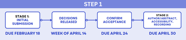
ASPIRE employs a two-step submission process, first for presentation at the conference and then for publication in the conference proceedings. The first step requires an extended abstract for most submission types. Acceptance at this stage grants authors the opportunity to present at ASPIRE.
Stage 1: Initial Submission
Stage 2: Author and Abstract, Accessibility, and Recording Permission
- If accepted, you must accept or decline your acceptance by April 24, 2025.
- If you accept, complete Stage 2: Author and Abstract, Accessibility, and Recording Permission.
- The information confirmed in this stage is what appears in the program and mobile app.
- Include any accessibility requirements necessary for your presentation.
- Grant or revoke approval to be recorded or live-streamed as part of the event if offered.
- If you wish to be published in the proceedings, please proceed to Step 2.
- If you will not be submitting a paper or extended abstract, no further action is required beyond completing Stage 2 in the submission site.
Step 2
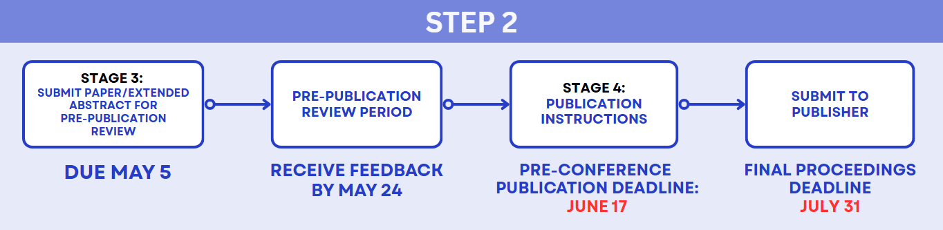
Authors may decide to optionally submit either a revised extended abstract or a 5-page paper for consideration for publication in the proceedings. Acceptance for presentation does not automatically grant acceptance for publication in the proceedings.
- Submitting a paper or extended abstract for publication in the ASPIRE – The HFES Annual Meeting Proceedings is optional.
- To be published as part of the proceedings, you must first complete the pre-publication review through the submission system.
Stage 3: Pre-Publication Review
- You must use the Pre-Publication Proceedings Paper template or the Pre-Publication Extended Abstract template.
- The paper at this stage should not include an author block or identifying information and should be blinded.
- To ensure adequate peer review, all authors must submit a draft of their proceedings paper or extended abstract for pre-publication review by May 5.
- While this is not the published version, it should be written as if it was final. The review round is intended to provide minimal edits and does not include proofing for grammar, syntax, or formatting.
- Your initial submission reviewers will review your paper, and you will receive their feedback by May 23.
- The relevant Technical Group Program Chair will provide one of the following statuses for your paper:
- Approval of the paper as-is.
- You will need to incorporate the reviewer's feedback into your final paper.
- Or rejection of the paper. This will only be for extreme cases where the work cannot be suitably revised. If a paper is rejected, the submitter will still be able to present at the conference but will not have their paper published.
- Authors who do not incorporate required edits into their final submissions may be rejected for publication.
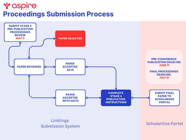
Stage 4: Publication Instructions
- Stage 4 provides instructions on how to submit your paper or extended abstract for publication after the pre-publication review.
- Follow all the instructions provided in this stage to ensure your paper or extended abstract is successfully submitted to the publisher’s portal, ScholarOne.
- Stage 4 also includes the option to submit your final paper for Student Technical Group awards.
Final Publication Papers
- If you would like your paper or extended abstract available to attendees before the meeting, you MUST submit the following to the ScholarOne Manuscript site by June 17:
- Proceedings Paper or Extended Abstract that has completed the Pre-Publication Proceedings Review process.
- Signed copyright transfer or alternative copyright form.
- For those whose employer requires them to use an Alternate Copyright form, you can upload additional files during submission. Please upload your signed copyright form to the File Upload section and select the Contributor Agreement designation.
- Papers submitted after June 17 will be published on a rolling basis after the meeting.
- All papers must be in by July 31st.
Final Publication Paper Formatting Requirements
- You must use the Final Publication Proceedings Paper template or the Final Publication Extended Abstract template.
- In addition to utilizing the appropriate template, the following guidelines must be followed:
- Papers can be five (5) formatted pages, including all figures, tables, images, charts, references, and acknowledgments.
- Extended Abstracts can be two (2) formatted pages, including all figures, tables, images, charts, references, and acknowledgments.
- Titles, keywords, and abstracts must be included in the manuscript file to ensure discoverability through online search engines, such as Google.
- Author information, including names, affiliations, sequence, and contact details, should be accurately listed in the manuscript file.
- Papers missing the author block will be rejected and returned to the author(s) for correction, which could result in delayed publishing.
- Each article should contain a Declaration of Conflicting Interests and Funding section, as per the COPE Guidelines on Good Publication Practice (2003).
- Tables and figures must be uploaded separately from the main document using the appropriate file type.
- Figure titles and captions should not be included within images, as they may not scale appropriately.
- Tables should be formatted using Microsoft Word or Excel, while figures created by authors should be submitted in their original file formats (e.g., Microsoft Excel, PowerPoint). Images should be in TIFF format with a minimum resolution of 300 DPI.
- All Tables and Figures in the article should be appropriately cited in the text, i.e., in-text citations of all Tables and Figures are required in the main article text.
- References and their in-text citations should adhere to APA formatting guidelines.
- Papers that do not meet the above-outlined guidelines may be rejected and returned to the author(s) for correction, which could delay publication.
- Any changes to a paper that has already been submitted must be routed to sagetracksupport@sagepub.com. HFES Education cannot make any changes to your paper on your behalf.
Speaker and Poster Presentation Logistics and Resources
Oral Presentations Logistics
- Most presentations will be part of a session with other presentations. Pay specific attention to the assigned time of your presentation.
- Usually, there are three presentations within a one-hour session. Each presentation is 12-15 minutes long and includes a Q&A. Please refer to the exact time of your scheduled session.
- Your presentation WILL NOT be pre-loaded onto the presentation computer. You must bring your final copy on a USB drive to your session.
- If you are unable to use a USB drive, please complete one of the following alternatives to get your presentation uploaded to the session room computer:
- Email your presentation to your session chair.
- Upload your presentation to the submission site and email education@hfes.org with your session date and time.
- You are strongly encouraged to use the ASPIRE PowerPoint template, developed with accessibility best practices in mind. If you must use a different template or tool, ensure your presentation is accessible to all attendees. Accessibility guidelines can be found here.
- We strongly encourage you to include a slide in your presentation that highlights practical implications or key takeaways for practitioners.
Please review the FAQ section below for further information.
Poster Presentation Logistics
- Detailed poster guidelines can be found here.
- You will be assigned to one of two poster sessions. You will only present your poster at your assigned session, not both.
- Poster Session 1 – Wednesday, October 15th
- Poster Session 2 – Thursday, October 16th
- You will be assigned a poster number in both the mobile app and the online program, corresponding to the location where your poster should be displayed.
- Please watch for an email with poster setup times closer to the event.
- Information on local poster printing options will be coming soon.
Please review the FAQ section below for further information.
Poster Formatting Guidelines
- Detailed poster guidelines can be found here.
- Your poster should be formatted to fit within the poster board space, which measures 3 feet 6 inches (42 inches or 106.68 cm) in width by 3 feet 6 inches (42 inches or 106.68 cm) in height. Formatting your poster to fit these dimensions will ensure adequate space for your poster and those of other presenters.
- Your poster will not be permitted to be posted if it is produced incorrectly and is too wide.
- The poster boards are divided so that two posters fit on each side. You will share a side with another presenter.
- Posters should be printed on material that can be securely attached to the boards using pushpins. Push-pins will be provided.
- The poster should be self-explanatory, and the text and graphics should be large enough to be read from a distance of six feet (two meters).
- The poster should contain the title, authors' name(s), and affiliation(s).
Frequently Asked Questions
Speakers
I'm experiencing an issue with the submission site. Who do I contact?
Please email education@hfes.org with a detailed description of the issue.
I need to make a speaker change on a submission. Who do I contact?
Email education@hfes.org with the submission title and new speaker’s information, including name, affiliation, and email address.
Am I required to use the ASPIRE PowerPoint template?
The use of the ASPIRE PowerPoint template is highly encouraged. The template is coming soon. All presentations must meet accessibility best practice guidelines.
Do I need to upload a copy of my PowerPoint slides to the submission site?
Although not required, it is strongly recommended that you upload a backup copy of your final slides to the submission site in case they are needed on-site.
Will my presentation be pre-loaded onto the computer in the session room?
No – You must bring a final copy on a USB drive. If you are unable to use a USB drive, please complete one of the following alternatives to get your presentation uploaded to the session room computer:
- Email your presentation to your session chair.
- Upload your presentation to the submission site and email education@hfes.org with your session date and time.
Can I use my computer to present instead of the one in the room?
No. The only exception made will be for Demonstration sessions.
Is there an option to present remotely?
No. We are unable to accommodate remote presentations. If you are no longer able to present, please email education@hfes.org immediately.
Proceedings
Can I submit an extended abstract instead of a full paper?
Yes, you can submit an extended abstract for publication.
What is the difference between a full paper and an extended abstract?
A “full paper” is five pages long and includes the components available in this template, like an abstract, acknowledgments, and references. An extended abstract is shorter, derived from your 2-page extended abstract submission in Stage 1, and employs a more straightforward format, as shown in this template.
Can I submit a paper or extended abstract for publication if my paper did not go through the Pre-Publication review stage?
No. All papers included in the conference proceedings must undergo review before being submitted to the ScholarOne publication site. Papers that attempt to bypass this step will be removed from the proceedings.
Where do I submit my proceedings paper or extended abstract?
Papers must first be reviewed and approved through the submission site. Once a paper is approved, it should be submitted directly to the publisher, Sage, via their ScholarOne site.
What is the maximum length? Does that include references and acknowledgments?
Papers may be a maximum of 5 formatted pages, including all references and acknowledgments. An extended abstract may be a maximum of 2 pages long.
I missed the June 17th deadline for paper submissions. Can my proceedings paper or extended abstract still be published?
Yes, you can continue to submit your paper to ScholarOne until July 31. However, it will be published after the meeting.
I noticed an error in my submitted paper; what do I do?
Email sagetracksupport@sagepub.com immediately with the submission title and manuscript ID outlining the error. Once the paper has been submitted, HFES Education staff can no longer make any changes on your behalf.
My employer requires me to use an Alternate Copyright form; how do I provide this?
You will have the option to upload additional files during the submission process. Please upload your signed copyright form in the File Upload section and choose the designation Contributor Agreement
Can I publish my paper in a journal if I present it at HFES?
Suitably revised papers printed in the HFES Annual Meeting Proceedings may be submitted for consideration in Human Factors, the Journal of Cognitive Engineering and Decision Making, Ergonomics in Design, or Human Factors in Healthcare. For more information, please visit our publication policies page.
Posters
Is there an on-site poster printing service?
HFES does not offer on-site printing. HFES poster presenters can email their poster file to FedEx directly at usa1085@fedex.com at $78.00+ tax. Last day to receive the poster file would be Thursday, October 9 in order to be ready for Monday, October 13th pick up. Hours are: Mon-Friday 9am – 7pm
FedEx Office is not located in the hotel, but in the connecting building.
Fed Ex: 111 E Wacker Dr Ste LL09, Chicago, IL 60601
Attendees are responsible for picking up their posters from the FedEx location.
Is there a table near or below the posters where I can set up a computer, iPad, or demonstration?
No – using additional materials beyond your poster is prohibited, as the poster receptions are highly attended, with many people walking around viewing posters.
Registration
Do all authors need to register?
At least one author for any poster or presentation must be registered for the meeting. Speakers register at the regular conference rate.
Is there a speaker discount?
There is no speaker discount. We encourage you to register early to take advantage of the Early Bird registration rates.
When does the Early Bird discount end?
Early Registration Deadline:
Can I register as a student?
To receive student pricing, you must provide a valid University ID at registration and be actively enrolled at the time of your presentation.
Additional FAQs
I need to request an accommodation that I did not list on my submission; whom should I contact?
Please email education@hfes.org with your request.
I can no longer attend the meeting or need to provide a replacement speaker.
Email education@hfes.org immediately.